The Density of Bubble Sort Plots
In my previous post, I shared a precise definition of what it means for a sorting algorithm’s scatter plot to approach a shape. I then showed that, as per this definition, bubble sort really does approach the curve derived in my video. Loosely speaking, the shape of a sorting algorithm was defined to be the set of points that is almost always “filled up” by the points in the algorithm’s scatter plots. But this definition ignores an interesting detail: how densely are different parts of the shape filled?
In this post, we’ll answer that question for bubble sort. We’ll be referring to the topics discussed in the other post, so you might want to read it if it feels like I pull something out of thin air.
What am I talking about?
Here’s a scatter plot of bubble sort, with the points categorized into three colors.
Clearly, the sorted section (green) is the most dense; the points are so tightly packed that it looks like a solid line. On the other hand, the interior of the unsorted section (blue) is the least dense. But the interesting part is the curve (red). The red points are way more densely packed than the blue points, but by how much exactly? How can we measure this?
Well to be honest, I don’t know the standard mathematical formulation of this question. I only know the most basic rudiments of probability theory, and the tools to tackle this problem are beyond any class I’ve taken. But if you’ll bear with me as I reinvent the wheel, I think you’ll agree that my answer is reasonable enough.
Unlike in my previous post, I think it is natural to consider the diagrams to be 2D when talking about the point density. We’ll consider the diagrams to have a width and height of 1; they will be contained in the unit square . We will also let represent the progress of the algorithm.
Defining Density
The idea is not too complex. Draw a little disc over the diagram. Find the proportion of the diagram’s points which are inside the disc. Divide this by the disc’s area to get its density. Then, by finding the densities of smaller and smaller discs, we can zero in on the density at a specific point.
To be more specific, we can let be the radius of the disc, let be the number of point in the diagram, and let be the number of diagram points which are inside the disc. The density is then
In reality, would be a random variable and we would need to take some kind of probabilistic limit as . But I don’t want to get too complicated, so let’s not worry about the technicalities.
This definition actually has a big problem: Some parts of bubble sort’s diagrams will be infinitely dense! This is because we’re assuming that the points are spread out over a 2D region, like they are in the blue section of the diagram above. But the red and green points are tightly compressed into a 1D curve. Dividing by the disc’s area only works when is proportional to its area.
But in these one-dimensional sections, we’ll find that is proportional to the disc’s diameter. So the fix is simple: for the red and green points, use the disc’s diameter instead of its area. Then the density will be
For each part of the diagram, we’ll use the appropriate definition of density, keeping in mind that every diameter-based density is “infinitely greater” than every area-based density.
The Easy Parts: Green and Blue
Let’s start with the sorted section (the green points). Since this is clearly a one-dimensional line, we will use the one-dimensional version of density. So, picking some point on the line, draw a disc of radius . For a list of items, the horizontal distance between the points is . Since the points are all lined up at a angle, they only intersect the disc over a width of .
Therefore , the number of items in the disc, will be about . So the density is
Since this doesn’t depend on , it will remain unchanged as , so is our final answer for the density of the sorted section.
The blue points are also pretty easy. These are the points which are lower than some point before them. I won’t go into detail here, but if you’re familiar with bubble sort, you can reason that these points move precisely one space to the left each iteration as a higher point passes over them. But since these blue points all move one space to the left — no more, no less — they don’t move relative to each other. This means that the density of the blue section will not change from what it was in the initial state of the list!
An important fact from my previous post is that, in the initial state of the list, the points are spread uniformly over the unit square. That is, if you draw some shape in the unit square, then the proportion of the diagrams points which are inside the shape will converge to the shape’s area as you consider larger and larger lists. So, letting the shape be our circle of radius , we find that the density is
(Remember that for the blue part we used the two-dimensional density, but for the green part we used the one-dimensional density. Even though the number we got for the blue part, , is greater than the number we got for the green part, , the green part is still infinitely more dense than the blue part.)
The Fun Part: The Red Curve
Here’s where we really start needing some ideas from my previous post. We’re going to shift the diagram to the right by the amount of time that has passed. That is, we’ll move every point to . This makes it so that no points ever move left as the algorithm runs. But more importantly, it allows us to draw boxes over the diagram, and the numbers of items in the boxes will change according to some simple rules. These rules are listed in here, but for our purposes we’ll only need one consequence of them:
No points can leave a box unless there are no points above it.
In other words, if we have two boxes and like this, no points will be able to leave until is completely empty.
With this in mind, let’s draw some boxes over the curve:
I chose these boxes specifically so that two corners of box lie on the curve. Let’s think about this situation for a minute. Since the curved region shrinks toward the bottom right corner as increases, it was passing through until this exact moment. This means that, up until now, was not empty, so no points could have left .
Also, is empty at this point in time. Since the points only move laterally, all of the points from must have moved into . But they can’t have left because ’s former non-emptiness disallowed it. So all the points which started in either or have been crammed into .
Now because of the initial uniformity of the points, the proportions of the points which started in and approach the respective areas of and . Since all these points have moved into , we have that
With this fact under our belt, we can make smaller and smaller, which allows us to zero in on the point density of the curve.
Getting Differential
We’ll pick some point on the curve, and draw a disc with tiny radius centered there. We can then construct the boxes , , and as above, with inscribed in the disc.
Now, let’s give names to some of the dimensions in this diagram. We’ll call ’s width , we’ll call its height , and we’ll its diagonal .
Since the red diagonal line is just a really zoomed-in picture of the curve, these values are the curve’s differentials. This red segment is also a diameter of the disc, so
Now, we can start thinking about the density. Let’s again let represent the number of points in the disc. We can see that
The comes from the points that are in the disc, but not in . These points are all blue, so we already saw that their contribution is proportional to , evident by the fact that the area-based density definition gave a finite value. These points will turn out to be negligible when we use the diameter-based definition of density, so we can just use big O notation and not worry about the specifics.
Applying the result of the previous section, we have
But what are these areas? Well, both boxes have a height of , the width of is , and the width of is . So, keeping in mind that both and are , we have
This means that the density of the disc is
As , the part will vanish, so we can just forget about it. Now we just need to find a more explicit expression for
Solving the Equation
As shown in my previous post, the curve is given by the equation
Fixing , we can differentiate using the product rule:
We can rearrange this to get
Now we can calculate the density:
Don’t forget that we had shifted the diagram by . So taking that into consideration, we can see that the density of a point on the original curve is given by
And that’s it!
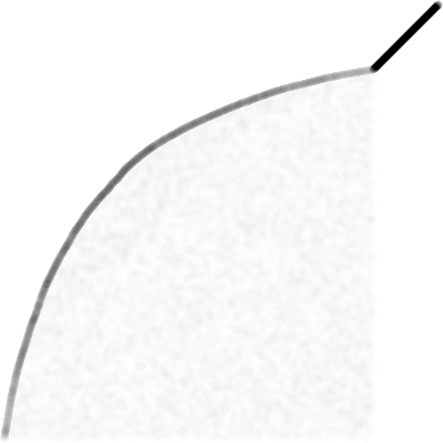
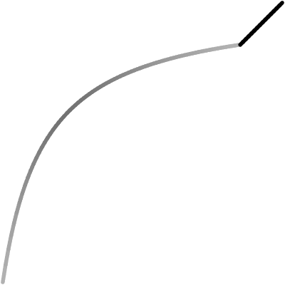
The left image below is a list of items at . The darkness of each pixel is proportional to the number of points within a small distance of it. On the right is the theoretical curve, whose darkness set by the formula we just found.


These images don’t have a lot of contrast, so it’s not super easy to compare them. But the fact that they appear to have similar gradients gives me some confidence that the solution is correct.
That’s All, Folks
I originally thought that this would be a really hard problem to solve, but surprisingly it wasn’t too bad (…for me at least. Whether my rambling is comprehensible to anyone else is a different story.) I do wish I knew the proper way to frame this question, and it’s still a bit strange that I needed two different definitions of density. If anyone knows more about this, feel free to reach out!
Anyway, that’s all for now. Hope this was interesting!