A Rigorous Derivation of the Bubble Sort Curve
Update: Before I wrote this post, a variation of the result had been proven independently by Krzysztof Bisewski, H. M. Jansen, and Yoni Nazarathy. Their paper “Nonparametric Testing via Partial Sorting” uses the bubble sort curve to define a generalization of the Kolmogorov-Smirnov test.
This post follows my video, The Bubble Sort Curve. You’ll probably want to watch that first. If not, you should at least be familiar with bubble sort.
My video answers question, “What is the shape formed by these diagrams?” Normally for a problem this silly, I would be perfectly happy with a intuitive but non-rigorous argument like the one in my video. But for some reason I couldn’t rest until I had found a precise, mathematical way to state (and then solve) the problem. After spending more time on this than I care to admit, I found a true proof and wrote it down.
If you want to see all the details, you can read it here.
But I don’t necessarily expect you to enjoy reading through pages of proofs, and all the technical details might obscure the intuition behind the main ideas. So I’ve summarized the method in this blog post. Full disclosure: This math goes a bit beyond my education level, so I don’t know the standard methods and terminologies for this kind of problem. I may revisit this once I’ve learned more, but for now, let’s get to it!
A Summary of the Solution
Diagrams as Sets of Points
In my video, the diagrams are bar plots. This is the most common visualization, but it has a couple of downsides when compared to the scatter plot representation. First, points are just plain simpler than bars. Second, the scatter plot gives a more “complete” representation of the shape. Bar plots make visible the shapes formed by the top of the diagrams, but they give the false impression that, under this topmost contour, the shape is solid. On the other hand, scatter plots have no vertical bias, so they could potentially form all kinds of interesting two-dimensional shapes. Here are the bar and scatter plots of a partially sorted list.

Alright, so maybe the scatter plot’s shape isn’t that much more interesting in this case. But it does more clearly show that the curved part has body, while the sorted part on the right is just a one dimensional line. So with the scatter plot we see more than just a curve. We see a two dimensional shape which changes over time. This means that the shape of the diagram will be a connected set rather than a real-valued function. For the example above, it looks like this:

Anyway, we’ll normalize the diagrams just as we did in the video: . One unit wide, one unit tall, and one unit of time. Then we can consider the diagrams to be finite sets of points in the unit cube, . To get into the nitty-gritty, if we have a list of real numbers in , we define the diagram to be the set
where is the height of the th item after iterations have been applied.
If we really want to have fun, we can interpret the time dimension as a third spacial dimension. This allows us to see the entire duration of the algorithm in one 3D object.
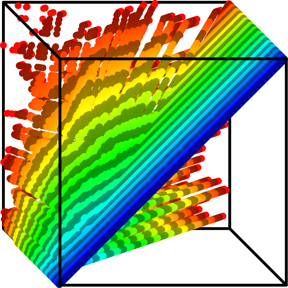
Admittedly, it’s a bit cluttered when projected to your 2D screen. To help with that, I’ve added a gradient and some stripes perpendicular to the time direction, which lets you see the curves. Though this visualization is mostly for fun, it might help once we get to the definition, since we will be treating the time dimension no differently from the spacial dimensions.
Uniformly Generated Lists
In my video, all the lists were generated by randomly shuffling the list of the first natural numbers. But I don’t see any reason to consider this to be the one true method of generating lists. Maybe instead we could throw darts at and list the numbers we hit. Will bubble sort still make the same shape? Probably. But it’s clear that not every method of generating lists will work, so there must be some criterion for curve-forming ways of generating lists.
We’ll call this criterion uniformity. A method of generating lists is uniform if in the initial state of the list, the points are spread uniformly over the unit square. Simple enough! But what precisely does it mean for the points to be spread uniformly?
Let’s say we have a list of items, and we’ve drawn some rectangle inside the unit square. Let denote the number of points which are inside of in the initial state of the list. Our method of generating lists is uniform if
for every possible rectangle . The symbol represents convergence in probability. This means that, though we can’t expect to perfectly equal the rectangle’s area for any particular list, it becomes more and more likely to be closer and closer to the area as increases.
Why does this definition make sense? Well, the unit square has area , so a rectangle of area takes up of the unit square. So if the points are uniformly distributed across the unit square, we expect that proportionally of them should be inside the rectangle.
I won’t spell out the proofs here, but you can rest assured that the common ways of generating lists are indeed uniform.
Arbitrarily Likely/Unlikely Statements
Update: I have since learned that this is a basic concept from probability theory: asymptotically almost surely.
The diagrams approach the shape as the size of the lists increases to infinity. But it doesn’t make any sense to talk about sorting an infinite list. Instead, we can reason about probabilities involving plain old finite lists of length , and then take the limit of these probabilities as .
In particular, we are interested in statements which are pretty much guaranteed to be true for really big lists. Let’s say is a statement about a list. Not a statement about a particular list, but a statement which may be true for some lists and false for others. We will say that is arbitrarily likely if
On the other hand, a statement is arbitrarily unlikely if
These definitions give us the flexibility to talk about the shape of the diagrams more realistically. We can’t say that the diagrams always form the same shape because there will always be rare pathological shuffles which don’t. But if those bad shuffles are arbitrarily unlikely, we can legitimately ignore them.
The definition of uniformity above can be translated into an arbitrarily likely statement. For a uniform method of generating lists, for any rectangle in the unit square, it is arbitrarily likely that is arbitrarily close to the area of the rectangle.
The Definition
Alright, we can finally define what it means to say that the diagrams approach a shape. We will classify each point of the unit cube as either included or excluded.
A point is included if for all , it is arbitrarily likely that there is a point such that .
On the other hand, a point is excluded if there is an such that it is arbitrarily unlikely that there is a point such that .
Basically, an included point will pretty much always be extremely close to a point from the diagram. An excluded point will pretty much never be extremely close to a point from the diagram.
Finally, if every point in is either included or excluded, then we say that the diagrams approach the set of included points.
Note that the definition starts with an “if”. Right now, we don’t know if bubble sort forms any shape at all by this definition, since we haven’t proven that every point of the unit square is either included or excluded. In fact, there are some algorithms which do not approach any shape as per this definition. For example, the shape of quicksort has different proportions each time, so most points are neither included nor excluded. But, as we’ll see, bubble sort does not have that problem.
Shearing the Diagram
Here’s a list of 10 natural numbers. Take a look at the way the items move over the first couple of iterations.

Notice how, although many items move left, nothing ever moves more than one space to the left in a single iteration. In this way, bubble sort almost behaves nicely. It would be great if items never moved to the left, because then we would only have one direction of movement to worry about.
Well, we can make that be the case! Just shift the entire list one space to the right after each iteration.

Of course, this modifies the 3D diagram. But it’s just a shear transformation; each point moves to . Since this mapping is continuous, it preserves included and excluded points. Therefore if we can find which points are included and excluded in this sheared diagram, we can just undo the shear, mapping the included and excluded points back onto the ordinary diagram.
Here’s the visual difference between the regular diagram and the sheared version.

As you can see, the only difference is that the curved part sticks to the right side of the unit square now, rather than the left side. (We’ll ignore that the sorted section begins to escape from the square. Our focus here is the curved part.) This may seem like an unimportant change, but stick with me here.
Drawing Boxes
The secret to proving the bubble sort curve is to draw boxes over the 2D time-cross sections of the sheared diagram. Then, count the number of points in each box. We will call this number the box’s value. Finally, observe how the boxes’ values change as we run iterations. This diagram shows the change in value of three boxes over an iteration:

One box’s value increased by , one box’s value decreased by , and one box’s value stayed the same. It turns out these are the only possible ways the value can change in a single iteration. In fact, it can be proved that the change in a box’s value is dictated by three simple rules.
- If the box is not empty and there are no points north, west, or northwest of it, then its value will decrease by one.
- If there are points both north and west, but not northwest of the box, then its value will increase by one.
- Otherwise, the box’s value will not change.
Take another look at the boxes above, and you can see that their values do indeed change according to these rules. This is why it’s so important to shear the diagram. If we drew boxes over the original diagram, we would not be able to find any simple rules (believe me, I’ve tried). The proof for these rules is not particularly glorious; it involves iterating through all the configurations of points at certain cardinal directions, and analyzing the behavior using theorems which didn’t make the cut for this blog post.
Now here’s what’s so great about these rules. We can partition the unit square into a grid of boxes and count the number of points in each box at the initial state of the list. Then we can forget about the points of the diagram, and instead just apply these box rules for each iteration! The values of the boxes will change exactly as they would if we were actually running bubble sort.
Here is a program which has the box rules programmed into it. Every “pixel” represents a box, and the pixel’s brightness corresponds to its value. Each pixel starts with the same value. It forms a perfect bubble sort curve!
Two Facts About Boxes
It turns out that we do not need an entire grid of boxes. We just need a couple specific types of boxes. First, boxes which touch the northwest corner of the unit square, which I will denote with . Second, boxes in the southeast corner of these northwest boxes, which I will denote with .

Since it’s impossible for any points to be north, west, or northwest of , the box will lose one point each iteration until it is empty. Let’s let represent the value of in the initial state of the list. Since we’re working with uniformly generated lists, it is arbitrarily likely that becomes arbitrarily close to .
Now, with the way we’ve normalized the diagrams, we will have performed iterations at time . Therefore if , it is arbitrarily likely that . Multiplying both sides by , we can see that it is arbitrarily likely that . That is, the number of iterations we’ve performed is greater than the initial value of . This gives us our first fact:
- If , then it is arbitrarily likely that is empty before time .
Another fact which is a little less obvious is that of all the points which leave , the ones in its southeast corner are the last to go. That is, is not empty until is empty. So by following similar reasoning, we can arrive at the second fact:
- If , then it is arbitrarily likely that is not empty until after time
Finding the shape of the sheared diagram
These two facts allow us to find the included and excluded points of the sheared diagram. Let’s start with the excluded points.
The Excluded Points
Let’s say that a point satisfies . This puts it above the curve defined by , as shown below.

We can make the box just barely big enough to contain . This box’s width is slightly more than and its height is slightly more than . Therefore its area is just a bit greater than . But we have a bit of wiggle room to make it small enough that its area will remain smaller than .
But then, by the first rule above, it is arbitrarily likely that is empty before time . Thus, there is some padding around which is arbitrarily unlikely to contain any points from the diagram. Therefore is excluded!
The Included Points
On the other hand, if , then is below (or on) the curve, and the area of is definitely greater than .

But now we can add a box in the southeast corner of which contains . The second fact about boxes tells us that it is arbitrarily likely that at time , the box will not yet be empty. Therefore, we can adjust the dimensions of the boxes so that becomes arbitrarily small, and it will always be arbitrarily likely to contain at least one point from the diagram. Thus, it is arbitrarily likely that a point from the diagram is arbitrarily close to , so is included!
Wrapping it Up
We’ve found that, after shearing the diagram, each point in the unit cube is included if , and excluded otherwise. So now we just have to undo the shear. Since the shear mapped to , the inclusion and exclusion of points for the non-sheared diagram is really determined by whether
This can be rearranged into
which should look pretty familiar if you’ve seen my video. And that’s the gist of the proof!
Of course, this is only the curved portion of the diagram. The diagonal line still has to be dealt with. But that’s not very exciting, so I’ll leave that out. Once we work through all the details, we get as our final answer that the shape of bubble sort is
… which is a mess of symbols. But it’s just a symbolic representation of the shape.
Here’s something more visual – a 2D representation with a slider for time.
And for fun, here’s a 3D representation to go along with the 3D point diagram earlier.